Someone building an effective homepage on their laptop with stats.

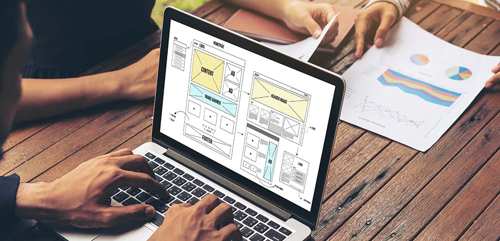
Your website’s homepage plays an important role. It’s the first impression of your business’ digital space. It also doesn’t have a lot of time to provide that introduction. The average user stays on a webpage for only 5.94 seconds and they judge it in only 1/20th of a second. As a result, your homepage needs to be purposefully designed to create a proper impression quickly. For that, it needs to look good, communicate effectively, and motivate your visitor to stay and use your site. Our website design team has the first steps so you can start building that impressive and effective homepage. 

Who Are You?

Your homepage should clearly and concisely present what your business is and does. Name and display your main services or top products as the central thing visitors first see as they land on your homepage. They will immediately understand your business and see its products/services. This should also come with a short description that identifies your business’ name and what it does. First-time visitors to your site will not be familiar with your business. Use this opportunity to provide that information and show off your value proposition.

Navigable

Along with explaining who you are and what you can provide your visitors, you want to make it immediately clear how they can navigate your site for more information or products. Link the central images and descriptions to the appropriate dedicated pages so visitors can access them. The top should include a navigation bar with clear categories and page titles, so users know where to look and find what they are interested in. In addition to being a directional aid throughout your website, the navigation bar will quickly impress any visitor with the contents of your website, allowing them to understand its contents and services more quickly. Furthermore, your homepage will regularly be the return point for browsing. This easy navigation will ensure customers can readily move to the next page that interests them.

Calls To Action

Another aid to navigation that also helps keep a visitor interested is a call to action (CTA). Common examples are a prominent button in the middle of the page or in the navigation bar with a unique, contrasting colour. These will encourage your visitor to go beyond the homepage and guide them through your website’s main pages. The most common examples are “Shop Now”, “Learn More”, “Contact Us”, “Book a Consultation”, or “Request a Quote”. These short, simple instructions will also help a visitor immediately contextualize the products/services your website provides.

Newsletter or Contact Form

Presenting your visitor with a pop-up of a newsletter signup or contact form is an additional call to action that will keep your visitor connected to your website. These allow customers to learn more about your business, stay connected and return, and might include a discount as an incentive to purchase from you. 

Do not present this pop-up right away. Allow your customers to get their impression of your homepage and maybe browse a bit before prompting them with signing up to their newsletter or suggesting they provide contact information. An immediate popup will prevent them from seeing your informative homepage and come off as pushy. Why would they sign up for a newsletter or want to contact you before they know who you are?

Less is Better

Not overwhelming your visitor is essential. Minimalism is a hallmark for designing your website’s homepage. A homepage with too much text, images, video, or CTAs will only confuse or frustrate your visitors. Just like when first introducing yourself, stick to the essentials and be concise for a good first impression. Provide a single large image, a short blurb, and one CTA that shows the essentials of your business. Not every visitor will have the same interests about your business, so it is best to provide the basics and have them navigate deeper in for what they want. Additional details should be placed in their own dedicated pages that visitors can easily access through the navigation bar or calls to action. 

Optimized for Multiple Devices aka Responsive

A proper first impression means your website needs to function properly on various devices, particularly computers and mobile devices. As of this month, over 60% of web traffic comes from mobile devices. Your homepage needs to inform your visitor, allow direct navigation, and provide direction easily and elegantly on all of those different devices. If a visitor arrives on your homepage and not everything is visible or navigation is cumbersome or impossible, they will be left with a poor impression of your business and leave.

Adaptable

Your homepage should adapt to how visitors use and browse your website. Monitor website traffic to determine where users are going. If a specific service or product page is more popular, highlight it more immediately. This will sooner impress future visitors with the information they want. Remember you have less than 6 seconds. For example, if customers typically browse your new product page, it is a good strategy to link the “Shop Now” CTA to that page. Running user experience (UX) tests of your homepage and website will help you discover such potential site traffic patterns as well as unintended obstacles. Ever heard of heatmapping? Ask us about it!

Home is Where the Heart Is

Your homepage is the heart of your website. It introduces your business, directs visitors, and acts as the regular return point for browsing. It also does not have a lot of time to impress your visitors to stay and start exploring the deeper chambers of your website. These essentials will help guide you to create a homepage that gives the proper impression and welcomes your visitors. If you are looking to redesign or update your homepage to give your business the proper introduction it deserves, contact Rosewood’s website design team.  

A customer using their laptop hooked in to check out

Social media, email marketing, and online advertising all help drive traffic to your business’ website, but the ultimate goal is converting that traffic to purchasing your products or services. From the moment a user accesses your website, there could be numerous moments that encourage or discourage them from making a purchase. You want to minimize the latter and maximize the prior. Your website needs to make that process easy, straightforward, and even encouraging. It needs to hook customers in, so they check out. Seamless and streamlined should be at the heart of your website’s shopping experience. Here are some essential tips to make sure your webstore is providing that smooth shopping experience.

Make Check Out and Booking Easy

A cumbersome checkout or appointment making process is an easy place to lose customers. For this reason, nearly 70% of carts are abandoned. The checkout process should be straightforward and easy to complete. To start, you can provide autofill, such as for addresses, to simplify the process. You can streamline the rest of process with express checkout through digital wallets like GooglePayApplePayShopPayPayPal as payment methods. All these load a user’s previously entered information for a seamless and immediate checkout. Another huge help is to make the promo code area clearly visible. You can even ensure promotions are automatically added. 

If your business is service based, make it easy for customers to contact you and/or arrange appointments. Only 33% of customers prefer scheduling appointments on the phone, meaning you should provide an online booking system for the more than two-thirds of customers that prefer it. For those who prefer direct communication, you should still provide linked contact information so that an email or phone call is only a click/tap away. Alternatively, you can present a fillable online contact form. Remember to keep it simple, so that users only need to provide essentials.

Getting Their Attention

Browsing and searching for just the right thing can sometimes be a fun treasure hunt, but it can also feel like sifting through dirt. The average user’s attention span for a single webpage is only 8 seconds. If customers do not see that right product or service quickly, they are more likely to leave. On the other hand, when customers immediately see products or services they are interested in, they are more likely to stay and browse. 

There are numerous ways to seize people’s attention. Banners on your home page that show a range of popular and new products or services can initially pique people’s interest. Testimonials and reviews can also help secure that attention. If customers come from an ad, email, or social media post featuring a product or service, it should take them to that specific page. Relying on them to find it themselves could leave them confused or frustrated.

Keeping Their Attention – Make Browsing Effective

Once you have gotten their attention, customers can be inclined to browse. However, the browsing experience still needs to be smooth and simple. Users should be able to easily find and move through products or services that interest them. To start, categories on each page will help customers immediately filter down to their interests. A search with filters is a simple way to help customers find their specific quarry. Showing similar items/services or those purchased together by other customers provides a curated browsing experience. Popups about product stock or deals can also guide and motivate customers to purchase. If they are repeating customers or clients, you can also use plugins to provide them with tailored recommendations based on their purchase history.

A Guiding Hand

At no point do you want a user to become lost while using your site. That can lead to confusion, frustration, and them leaving your website. Provide clear directions for customers to move through their shopping or booking experience. A clearly visible checkout or booking button on the top of every page on your website ensures customers are always only one click away from when they decide to move onto that next crucial step. After customers add an item to their cart, present an unobtrusive popup that confirms the addition and prompts them to check out or continue shopping. Keep call to actions like these as subtle nudges. Large popups or forced redirects can be overwhelming or confusing. 

Getting Their Attention Back

Although many carts are abandoned, that doesn’t mean people have lost interest. Sometimes life gets in the way. One of the best ways to get users back is abandoned cart emails. These automated emails remind customers about the products they have left sitting in their cart.  Personalized automations, like cart abandonment and product recommendations, are extremely effective for regaining a customer’s attention. Their average open rate is over 41% with a click rate of 26%, giving you another chance to hook them in for that checkout.

The Essential Information

Customers and clients will want to know certain things about a product or service. Leaving them to contact you or search for the information on another site will drastically increase the likelihood of them abandoning their cart or booking. Provide the essential details they should know. Measurements, size charts for clothing, shipping lengths, service timelines, and other specifications are all important details customers will want to know. 

If customers approach your business regularly with a question about a product, take that as a cue to add that information to the product or service page. A set of questions you commonly receive about your business or service, such as shipping, should prompt the creation of a frequently asked question (FAQ) section. 

Similarly, reviews are a valuable resource. You don’t want customers to go to another site to find them. Shopify provides plugins that add your own or connect Google reviews. These testimonials tell customers other essential information not provided in specifications, while increasing brand trust and authenticity.

Testing

You shop plenty online yourself. Test your website or have an associate try. User experience (UX) testing is one of the most valuable ways to ensure your online store’s functionality. If something is missing or not immediately apparent in your own run-throughs, that suggests a space for improvement. Similarly, listen to customers’ questions. Some might contact you about an issue with their user experience. That information is extremely valuable for streamlining and simplifying other users’ experience.

There’s Always Room for Improvement

Every moment they leave your site increases the likelihood of an abandoned cart or booking. Providing that optimal experience to help your customers check out requires constant monitoring. Keep your eyes and ears open. If you’re hoping to improve your website’s checkout rate, Rosewood’s web design team knows all the best practices. Our marketing team will make sure your ads are giving users a proper welcome and can also help you set up those personalized email automations that keep them returning.

Deanna busy at her desk.

At Rosewood Marketing, we use the e-commerce platform Shopify to build beautiful and effective online stores. Shopify has a robust toolset that allows it to create stores for businesses of various sizes and types. For small and large businesses, it supports online product sales, brick and mortar locations, service-based businesses, and even subscription models. Shopify also has a wide suite of plugins called apps, that increase your online store’s functionality even further. Most of these apps are free to start and include scaling subscription fees for extended functionality. There are tons to choose from, so to help you find the best, here are our favourite Shopify apps and why you should love them too.

Frequently Bought Together

Upselling is one of the simplest ways to boost sales. We love Frequently Bought Together because it provides immediate and smart product recommendations to those shopping for products on your store. It’s simple in concept yet powerful in practice. It has a wide set of customization tools, comprehensive stat trackers, and you can even create bundled discounts. All of these make this app an easy favourite .

Klaviyo

Klaviyo has swiftly become one of digital marketing bests. It provides an advanced suite for email and SMS marketing that is hooked directly into your Shopify store. Klaviyo provides a wide set of templates that allow for beautiful, branded communications with advanced HTML features. That comes along with a wide set of email and SMS automations that connect directly into your Shopify store. These allow for audience segmentations, abandoned cart reminders, product recommendations, and win-back campaigns that help drive sales.

Privy

Privy is an all-in-one app for your store’s digital marketing. This ecommerce omni-tool provides your online store with on-site popups, email marketing, and SMS messaging. Privy’s email and SMS messaging has similar functionality to Klaviyo, but with limited functionality and support for fewer contacts. It’s better suited to smaller scale communication. It also integrates directly with MailChimp. However, its on-site popup functions are where Privy particularly excels and earns our love. Popups can motivate users to sign up to your newsletter, click on cross-sells, or spin a contest wheel. 

Sales Popup 

Popups help drive conversions by making online shopping more convenient. Sales Popup excels at social proof and creating urgency. It can inform users about a product’s recent sales and amount sold as proof of wider interest. It can also notify a user about limited stock or show a sale to motivate purchases. Just be sure not to overwhelm your shoppers with too many popups. This will make shopping on your online store stressful or agitating, rather than exciting or thrilling.

Zipify Pages

Just like in a physical store, you want to welcome customers when they arrive to your online one. Zipify Pages is perfect for creating elegant landing pages that greet and guide your customers. Along with an easy builder, Zipify allows you to A/B split test different landing pages, create call-to-action sticky buttons, display product carousels, and highlight cross sells. All of these features help a user know they’ve come to the right place.

Smile

Loyalty programs are effective for customer retention. 84% of consumers say they are more likely to stick with a brand or business that offers a loyalty program. We love Smile as the perfect Shopify app for adding a loyalty program to you online store. After an easy setup, Smile can add loyalty points, referral rewards, a VIP program, and more to boost brand loyalty. All of this helps with customer acquisition and retention.

Google Customer Reviews

Customer testimony is important for helping build consumer trust and your brand’s authenticity. 89% of users read online reviews before purchasing a product or service, and 59% of buyers use Google reviewsGoogle Customer Reviews is a Shopify app that adds Google review functionality to your store. It can add a seller rating badge to your website, display product and store ratings on Google shopping listings, and automatically request and collect customer reviews. This specific app doesn’t have a subscription fee. Instead, it only costs a one-time $25 dollar charge to add to your store.

Product Reviews

Shopify also offers their own Product Reviews app. This app adds a review system directly into your store so customers can easily view and leave purchase reviews on items and services in your store. It also includes tools to easily review, publish, or hide reviews. They can even be exported into a spreadsheet. Plus, as a bonus, since this app is developed by Shopify, it’s completely free to add to your Shopify store.

Just the Start

These apps will provide a wide slew of features to your online store that increase its potential to drive sales. You don’t need to start adding all of them now. Consider what features are most essential and beneficial for the moment. Build those up before you find your store loaded with partial features.

There are even more great apps to consider. Shopify’s wide feature set and these powerful apps make it perfect for every kind of business. If you’re Interested in developing a Shopify store, want some help picking your perfect apps, or taking your ecommerce to its highest functionality, contact Rosewood’s web design team. If you need help with Klaviyo or another email service, our marketing team can provide you with stunning email communications.