Pantone colour swatches with some that can't be differentiated for those with colour blindness

Accessibility is important for any website’s design. It allows the most possible people to access your business online. A key part of that is ensuring everything in your web design is clearly visible. Along with contrast and size, you also need to consider colour blindness for accessiblility in web design. If a web design doesn’t consider different levels of colour vision, certain elements of the site will become indistinguishable or even invisible. That creates a frustrating experience, and users will leave. We’ll explain why colour blindness matters for web design and some of the best practices for ensuring an accessible contrast on your website.

The Kinds of Colour Blindness or Colour Vision Deficiency

Colour blindness is often used as the general term for all colour vision deficiencies, but there are different kinds. The most common type that affects 8% of all males is “red-green” colour blindness. This is usually either from deuteranomaly or protanomaly and refers to their inability to see reds and greens as vividly. However, there are other less common types of colour blindness to also consider in your web design. There is blue-yellow colour vision deficiency, where blue and yellow are less visible. The other is monochromacy, where someone sees no colour at all and instead views the world in grayscale (black, grey, and white). An ideal web design should be accessible to all of types of colour blindness. 

How Colour Blindness Affects Sight or Visual Acuity

Skipping over the details of the biology, when someone has red-green colour blindness, they see greens and reds less strongly than those with normal colour vision. Most can still tell the difference between a red object and a green one, but each colour will be less vibrant. The difficulty comes in colours that have red and green in them. That is why someone with red-green colour blindness has difficulty differentiating purples from blues. They see less of the purple’s red, turning it blue. This is also something to consider in your web design. For example, if your design includes orange and neon green items next to each other, it will be difficult for someone with red-green colour vision deficiency to differentiate them. This is because they see the yellow in each colour more than the red and green. Depending on the strength of the deficiency, even something yellow will be difficult to pick out from the other two.

How to Accommodate Colour Blindness in Web Design

To be sure that everyone can see everything on your website, you need to be sure that even someone who can’t see colours can still differentiate text, images, or buttons. There are various techniques for colour accessibility, but here are some of the most essential for web design:

Don’t Rely Exclusively on Colour 

One of the staple practices in accessible visual design is to not use colour as the only differentiator. Those with colour deficiencies can still see shapes and other visual markers. For example, hyperlinked text shouldn’t just be blue or another colour. It should also be underlined to be recognizable to any level of colour vision. Bars in a graph with patterns inside along with colours are always distinguishable. This is the same design choice behind coloured tiles in a board game also having certain shapes.

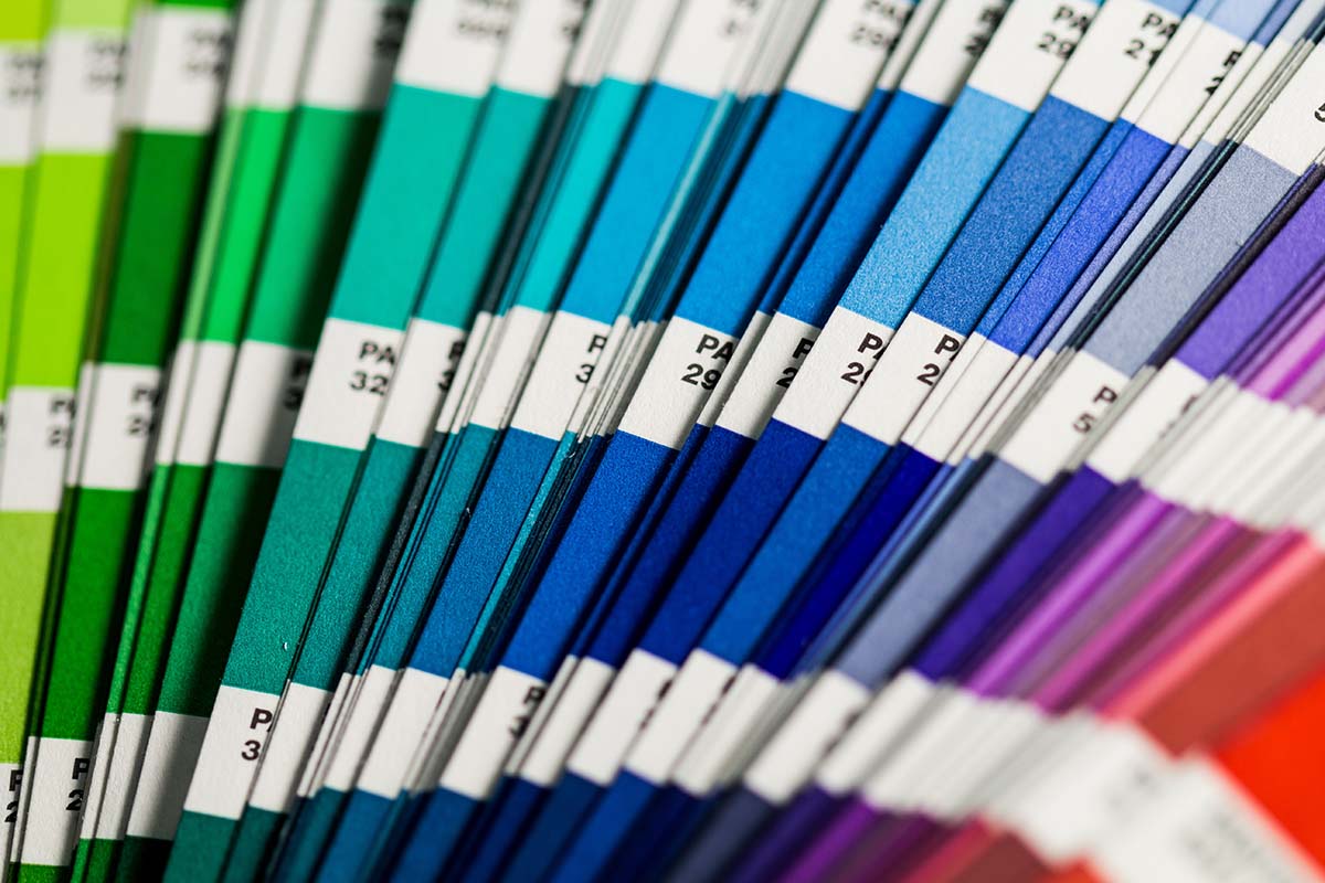
High Contrast Colours 

Use colours that have high contrast to keep them distinguishable. For example, Rosewood’s web design primarily uses white and blue. No matter the kind of colour blindness, these can’t be confused. You can run a basic contrast test between two colours with a tool provided by Web Accessibility in Mind. The plug-in tota11y will check your entire website for various visual accessibility concerns, including contrast.

Keep it Bright 

Colour vision deficiencies have a harder time differentiating darker colours. Using brighter colours will help them stay visually distinguishable. 

Not All Complementary Colours Contrast Equally

Choosing two colours on the opposites of the colour spectrum, such as black and white, can typically provide good contrast. However, that isn’t true for all kinds of vision. Blue and yellow are complementary colours with a high contrast value, but they are less distinguishable to those with blue-yellow colour blindness. That is why blue and orange are often used instead. The red in the orange helps it stand out from the blue.

Using Greyscale 

Designing a site in greyscale (grey, white, and black) will ensure its visible to all colour vision deficiencies. However, your branding may include pops of colour. In this case, various web tools and screen filters built into MacOS and Windows will allow you to look at your site in greyscale. This simulates an extreme monochromatic experience and can help you see whether some colours in your web design might be confusing.

Web Design Everyone Can See

If you have full colour vision, it can be easy to forget not everyone sees the rainbow as vibrant as you. However, accessibility is a critical part of web design used to create a website that accommodates everyone’s abilities. An accessible website creates a welcoming digital space. If you make sure every part of your web design stands out, your business will too. If you want to be sure your web design accommodates different colour vision deficiencies, contact Rosewood’s web design team. They’ll make sure your colours shine.

Computer mouse over a spam inbox with 372 emails

Email is still one of the most powerful marketing tools and platforms for communicating with your audience and customers. With over 4 billion users, most people prefer to receive brand communications via email. However, your email marketing and communications can only work well if your email retains a healthy reputation and avoids spam complaints. Otherwise, you’ll impair your ability to communicate with your customers, market effectively, and could even suffer fines. This can all be a little complex, so to help you understand all this, we’ve created a comprehensive guide to email reputation and spam complaints.

What is Email or Sender Reputation?

Email is extremely easy to send and automate. As a result, it’s also easy for someone to send countless unsolicited emails. If there were no filtering and monitoring systems, everyone’s inbox would quickly become inundated, at least more than they already are, with emails. As a result, internet service providers (ISPs) and email service providers (ESPs), like Gmail, use reputation systems to separate legitimate emails from fake or malicious ones. They track the his reputation by the number of emails sent in a certain time, their open rates, the engagement levels, and parsing the email text for malicious or deceitful content. If too many are sent, unopened, or users report your emails as spam, your email domain’s reputation reduces. If it drops too low, your emails become undeliverable. Conversely, if emails are opened and clicked, the reputation increases and emails will reach their targeted inboxes.

Why is a Low Sender Reputation Bad?

If an email domain has a bad reputation, their emails will be filtered to the junk/spam folder or worse, never reach a mailbox. In either case, your email marketing and communications won’t reach the recipients’ main inboxes and will remain unopened. Developing a bad email reputation becomes a circular problem. As less emails reach recipients’ inboxes and reroute to spam folders, your audience opens and enages with less emails. If low enough, further negatively impacts your reputation. A bad reputation won’t affect just newsletters or other broad communications. With a low enough reputation, even purchase or order updates won’t be delivered. That’s why maintaining a healthy email reputation is vital to your business’ online operation as well as its marketing. 

Developing a Healthy Email Reputation

When you start sending email communications, your email will have little to no reputation, good or bad. As a result, you will need to slowly build up and strengthen it. To do this you will need to start sending emails that are opened and clicked. Shipping and purchase confirmations will help with this. If you are sending communications to a set of subscribers, like a newsletter, you will start sending in smaller batches to avoid looking like an automated spammer. Most email services, like Klaviyo, provide this as a warming up process. You will also need to repeat the same warming process should you change your ESP.

Some other strategies to increase sender reputation are to only include links to reputable websites. Personalizing emails will increase your open rate, indirectly improving your reputation. You will also want to avoid any spam complaints, so be sure to send emails to recipients who have consented and are expecting to receive emails from your business. 

Avoiding Spam Complaints

One of the main things that can harm your email sender reputation out of your direct control are spam complaints. Most ESPs allow for users to identify and report an email they’ve received as spam. When they do this, the complaint is registered to the ESP, and ISPs track this event. As a result, your reputation will quickly reduce as multiple users report your emails as spam. To avoid those, you will want to send emails that are expected and wanted by your audience. It’s also good to avoid spammy phrases, like “free”, “bargain”, “cash”, or all capitals. Users are more likely to immediately report these emails as spam, and ESPs can automatically filter these phrases to spam. 

Canadian Anti-Spam Legislation

Avoiding spam complaints isn’t just a matter of interest and email efficacy. It’s also the law in Canada since 2014. Canada has anti-spam legislation (CASL) which makes it illegal to send unsolicited emails or messages to those who haven’t provided their consent. Lack of consent is a primary issue and is the cause of over half (68%) of reports made to CASL. Consent is either explicit (someone has agreed verbally or in writing to receive emails) or implicit (a previous interaction with your business allows you to send pertinent emails for a limited time.

To send newsletters or other broad marketing communications under CASL, you need explicit or implicit consent. However, implicit consent is time-limited at a maximum of 24 months, still requires thorough records proving it, and most third-party platforms have more strict terms of service that will require explicit consent regardless. That’s why it’s best practice to and we recommend you obtain explicit consent. Plus, consent must be easily revokable at any time through an unsubscribe link at the bottom of your email. Many email marketing platforms such as Klaviyo and Mailchimp will require you to have one in your email before it can be sent and will include one for you.

If you lack that consent and send emails, your business is in breach of CASL and recipients can report you to the government. Nearly 6800 reports are submitted weekly. Enough reports can lead to an investigation and possible fines. Fines begin at a few thousand dollars, but an individual can be charged per violation up to a maximum of $1 million, while a business can be required to pay up to $10 million for spamming recipients. Along with the fines, your business’ violations and penalties will be recorded on the government of Canada’s website. That will harm more than just your email’s reputation. Plus, ISPs and ESPs monitor these lists, and your business will be recorded, requiring you to rebuild your sender reputation.

The Responsibility of Email

Email is a powerful marketing and communication tool but needs to be used responsibly to maintain a healthy sender reputation. If you fail to respect spam legislation and proper communication standards, your sender reputation will drop, directly impairing your business’ ability to communicate with its customers and audience. If you want to learn more about build a healthy email reputation, have interest in the exact requirements of CASL, or want to learn how to obtain explicit consent, contact Rosewood’s marketing team who are experts on all things email.

A perfect flat lay with photos, hat, and sunglasses on a white furry background

Flat lay photography has become a versatile visual form for any small business. These minimalist photos of products taken from above and arranged with props use minimalism to create visual emphasis. That simple presentation style makes items pop, perfect for promoting products on a website or grabbing the attention of those browsing social media. Whether you’re getting started making your own flat lays or looking to master the technique, here are 8 easy tips for creating perfect flat lays. 

1. A Fully Clean and Flat Surface is Essential

Flat lays are named for everything being laid on the same, flat level. A completely flat and clean surface creates the blank canvas necessary to make perfect flat lays. Everything sits on an equal level and receives full lighting, leaving nothing obscured. That flat surface will also lack shadows, making it the perfect canvas to edit in texts or graphics when editing.

2. Perfect Flat Lays Need Proper Lighting

Bright lighting is what makes flat lays so eye-catching. To accomplish this, you need a soft, broad light. Natural light in a bright space can work but is out of your control. Artificial lighting will give you full control but can come with a cost. We recommend starting with a lightbox or ring light. These are relatively cheap in the world of photography equipment. If you’re interested in more professional grade equipment, a strobe light with a soft box provides a perfect mimicry of that soft, natural light of a sunny day. Of course, if you aren’t looking to get this equipment, you can always hire a professional photographer for truly perfect flat lays.

3. Props Bring a Flat Lay to Life

A flat lay isn’t just merely a photo of a product or something your company makes. It should also invoke a certain emotion or theme. Props help bring that life and character to a perfect flat lay by creating a lifestyle context that viewers can imagine. For example, a flat lay of cosmetic products can be brought to life with some related props such as makeup brushes.

4. Flat Lays are for More Than Just Products

Flat lays are great for showing off a business’ products, but they can also evoke a certain moment or emotion that’s associated with your brand. This is particularly great for businesses that focus on services. For example, a catering company can create a flat lay of an ornate table setting. An interior designer can have a flat lay of an idealized work surface that includes a blueprint, furniture catalog, laptop, and a cup of coffee. A salon might create a flat lay with the various hair cutting and styling tools they use.

5. Create a Colour Palette

Part of the effective and eye-catching minimalism of flat lays is accomplished with a limited set of colours that unite the image. Determine a colour palette that works well both with the featured product(s) or props while keeping the background neutral. This will help tie the entire picture together, giving it a cohesive look for a perfect flat lay.

6. Your Flat Lay Background Doesn’t Need to Be White

Part of designing your flat lay and its colour will mean choosing a proper background. Marble, tile, and wood can be great options depending on the content, but flat lays work best with solid colours. That doesn’t mean the background needs to be white, especially if the products you’re showing off are. Instead, a solid background of colour can help the items pop. A large roll of paper can create a perfect background. 

7. Don’t Underestimate Negative Space

Flat lays are defined by minimalism. If they become cluttered with objects, they become too visually busy and important objects blend into others. Keep a healthy amount of negative space in the flat lay and around each object. This keeps them distinguishable and visually prominent. A simple rule: if you think there might be too many things, remove one.

8. Take Multiple Shots

Like any photography, one photo usually won’t suffice. Take many photos of your flat lay at different angles and orientations from above. Then, rearrange items and take even more shots. It’s always much easier to take as many photos as possible when you have already collected and arranged the materials than realizing you need to collect and arrange everything again because you didn’t capture that perfect shot. Taking all these various photos will provide you with a rich library of shots to choose from, ensuring you have at least a few you will want to use.

Flat Lays are All About the Pop

They might be called flat lays, but visually they are anything but flat. These 8 easy tips are sure to help you start perfecting your flat lay photography. If you’re interested in professional flat lays, contact Rosewood about our brand photography services. We’ll be happy to help you create flat lays that truly pop.